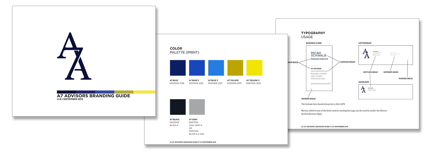
A7 Advisors, a risk management consulting firm, approached me to develop their identity and branding. After spending some time learning about their practice and how they would like to be seen by clients I created a logo and stationary that spoke to both the experience and innovation that was at the core of their brand.
Research/ The firm’s name had come from the Unicode values needed to display the Section Sign (“silcrow”) that is used to designate a new section in legal documents. In looking at other items that were related to “A7” I came across the A7 bar in New York that had been the birthplace of the city’s hardcore scene, and the A7 Stereograph machine that allowed two separate images to be seen in 3D. Some common themes began to emerge: The combination of two elements, innovating on existing ways of doing things, and viewing something from more than one perspective.
Inspiration (L-R): Section Symbol, A7 Punk bar in NYC, A7 Stereograph.
Ideas/ I began to sketch out ideas, trying to find ways to incorporate various elements that would communicate both the name of the firm and what it stood for.
Logo/ After presenting various ideas to the client and receiving feedback, we settled on a logo that relayed both the firm’s name and the ideas of combining tried-and-true traditions with future-facing innovations, and providing multiple perspectives.
Final Deliverables/ With the logo finalized, I worked on the remaining identity elements, including letterhead, envelopes, business cards, and a branding guide that could be used for any future needs.


